Reading the screen
Wednesday, 18th November 2020 ◆ Detain for finite arrangement to find differences (15) ◆ Comments (2)I used to play a lot of Age of Empires when I was younger, but I had largely forgotten about the game until my brother suggested we try playing the definitive edition, which released a couple of years ago.
In the main, it's been a joy to rediscover the game. Despite being over 20 years old, the game is still great. I admit that my enjoyment of the game may be coloured by nostalgia, but even still I think there is one key factor which its sequels have gotten "wrong".
Namely, that's the ability to scan the screen and understand what's going on at a glance. The colour palette allows you to distinguish unit from background easily, and to distinguish units from one another.
I think this is an incredibly important design feature, and I want to look at some examples drawn from outside of Age of Empires too.
Age of Empires 1
As a first example, let's look at the five basic units you can build from the stable in Age of Empires 1:

From left-to-right, these are:
- Scout - black horse
- Chariot - chariot drawn by brown horse
- Cavalry - white horse
- Elephant - grey elephant
- Camel - brown camel
It's a subtle feature, but the decision to make each of the horses a different colour is excellent design. It means you can very quickly ascertain exactly what units you are dealing with!
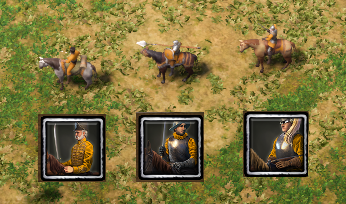
In Age of Empires 3, civilisations vary a lot more in terms of their technology tree. However, I'll take Spanish as an example. They can build three units from their stables:

- Hussar - grey horse
- Veteran Lancer - brown horse, with black mane, wielding a long pike
- Veteran Dragoon - brown horse, with brown mane
To me, these all look a lot more similar to each other. The washed out palette means the light grey and brown are much more similar. I think they also merge into the default background a lot more, compared to AoE1 where the units really pop out.
I've also included the unit icons to show that even the Hussar, which is recognisable because of the grey horse, has a brown horse in the UI. Likewise, the Lancer's icon has a black horse with brown mane. To me, this is simply bad design.
Maybe this is some tradeoff between realism and gameplay - but for me, AoE 1 wins out.
British Coins
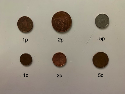
This reminds me of something I appreciate with British money: each coin is very different in either size, shape or colour. Let's compare the three smallest Sterling coins with the three smallest Euro coins. Those are 1, 2 and 5 pence and cents:

There is no denying that the Euro coins are a lot more similar. They are all the same colour, and I would say near enough the same size too. Again, I would label this bad design.
Rainbowisation
In a similar vein, I've recently seen complaints about Google's "rainbowisation" of their logos. Similarly, it is becoming difficult to tell their various apps apart at a glance.
True! It was not just me. pic.twitter.com/FuW43KgHeT
— César A. Hidalgo (@cesifoti) November 10, 2020
Conclusion
I am currently making a chess-based game where I will have a lot of custom pieces. I really need to make sure I get the design of those pieces spot on: if a player can't tell the difference between a pawn and a spearman, it may cost them the game!
Let me know if you can think of any other examples...


Comments
Another example: the 2/3 and 5/56 in wodka red shuffle :D
I claim any option in the “advanced” section comes with a “use at your own risk” disclaimer!